ABOUT
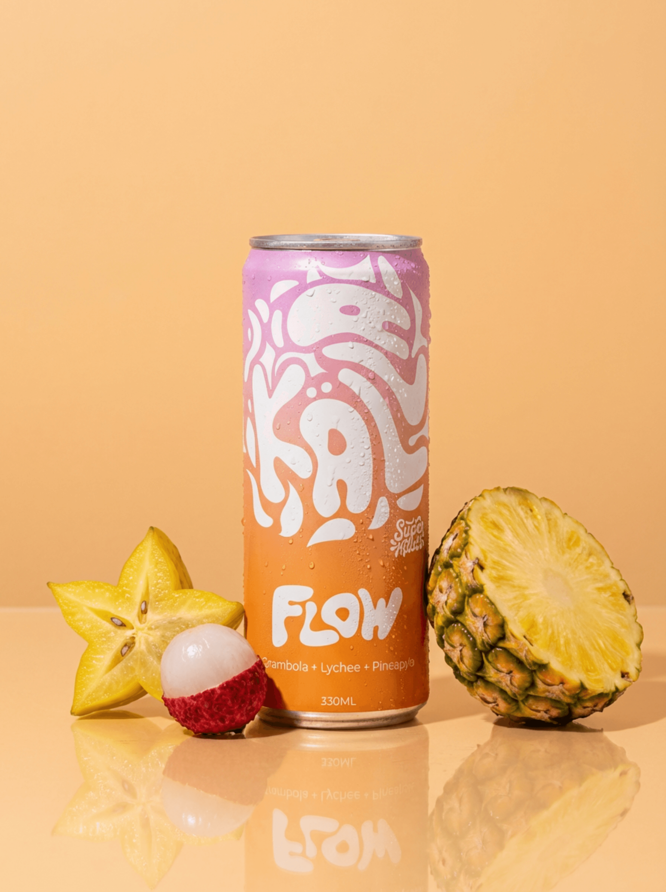
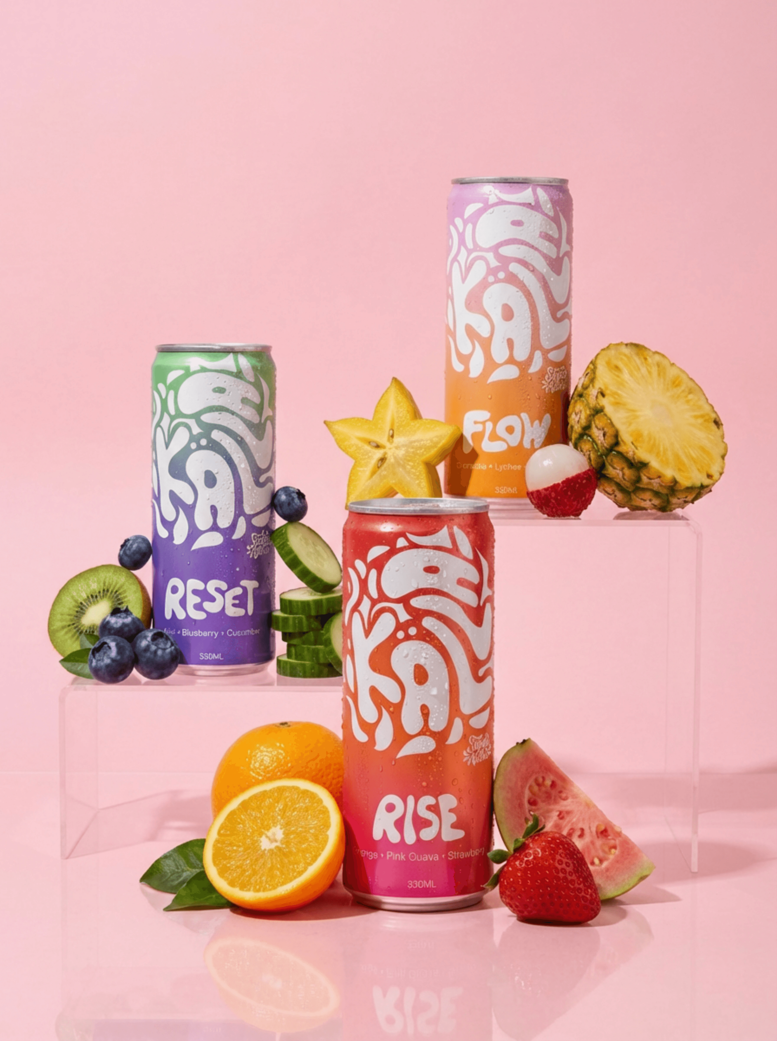
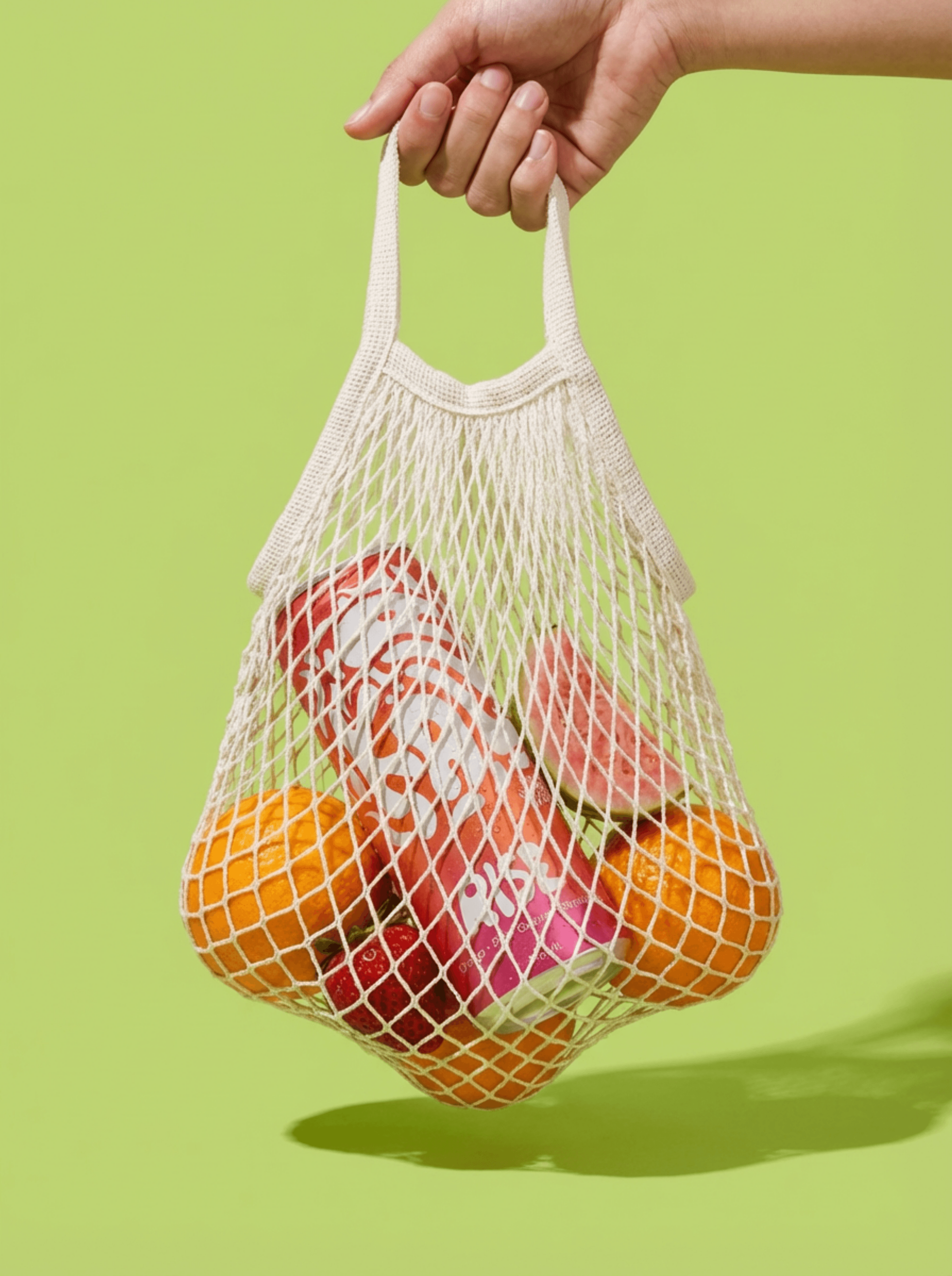
KÄLLA’s aesthetic centers on fluid clarity, using every visual choice to reflect the pure meaning of its name as the ultimate source while embracing a bold, Swedish simplicity that feels entirely modern. The color palette relies on a dynamic gradient system unique to each flavor, utilizing shifting hues that capture the specific ingredients and mood of the drink inside. This colorful and expressive approach is anchored by clean, minimal typography, keeping the overall design balanced, contemporary, and ready to stand out on the shelf. Grounding the entire look is a focus on organic, liquid-inspired imagery. The custom logotype moves fluidly across the cans as if in constant motion, acting as a bold visual stamp. This creates a cohesive, scalable system where each flavor profile transitions from a vibrant blend of Orange, Pink Guava, and Strawberry, to a crisp mix of Kiwi, Blueberry, and Cucumber, and finally to an exotic fusion of Carambola, Lychee, and Pineapple, ensuring every can tells its own unique story while remaining part of a unified family.
Year
2026
Services
Brand Identity




More works


/Contact Us
+46 70 050 38 45